Burnup Chart

Following the burndown chart's introduction, the burnup chart offers a complementary perspective on tracking project progress in Agile project management. Unlike the burndown chart, which focuses on the work remaining, the burnup chart illuminates the journey towards project completion from a different angle.
Essence of the Burnup Chart:
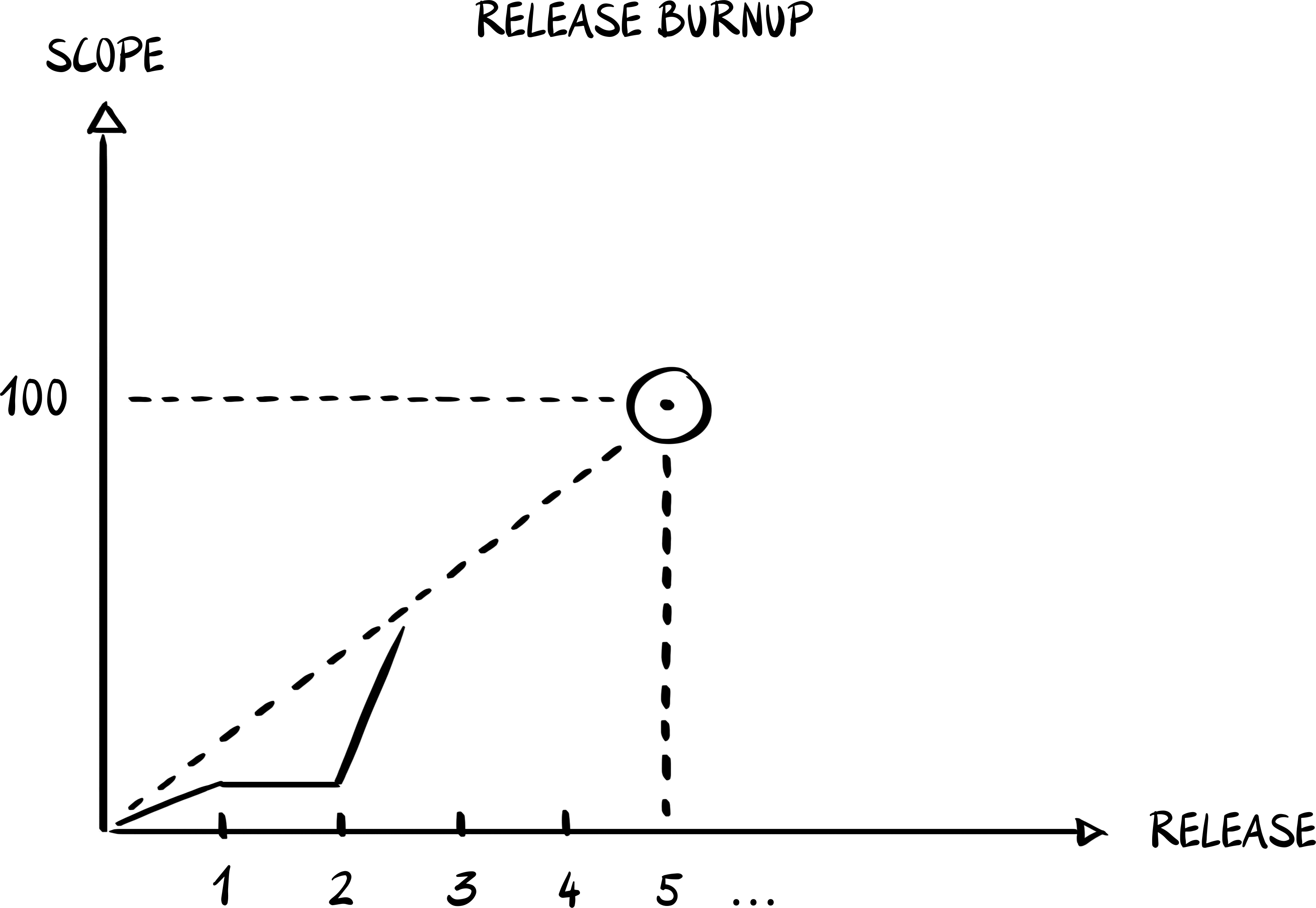
The burnup chart is a visual tool that charts two primary metrics: the cumulative work completed over time and the evolving total project scope. This dual-line graph showcases the project's progress by plotting the amount of completed work against the predetermined or evolving scope of the project. The horizontal axis (X-axis) marks the passage of time, typically in days or sprints, while the vertical axis (Y-axis) quantifies the work, measured in units such as story points or tasks.
Key Differences and Advantages**:
Scope Adjustment Visibility: One of the burnup chart's distinct advantages is its ability to visualize scope changes explicitly. The total scope line adjusts to reflect any increases or decreases in project scope, offering stakeholders a clear view of how such changes impact the project timeline and workload.
Comprehensive Progress Overview: By tracking both the amount of work completed and the total project scope, burnup charts provide a fuller picture of a project's progress. This broader perspective helps teams and stakeholders understand not just how much work has been done, but how that work measures up to the overall project goals.
Facilitates Strategic Planning and Adaptation: The clear visual representation of scope changes and progress towards project goals makes the burnup chart an invaluable tool for strategic planning. Teams can use this insight to adapt their strategies, ensuring they remain aligned with project objectives and stakeholder expectations.
When to Use a Burnup Chart:
The burnup chart is particularly useful in environments where the project scope is expected to evolve. Its ability to explicitly track and display scope changes makes it ideal for projects that require flexibility in planning and execution. Moreover, for projects where understanding the relationship between completed work and total scope is crucial for stakeholder communication and strategic planning, the burnup chart offers a distinct advantage over the burndown chart.
In summary, while the burndown chart provides an excellent tool for tracking sprint progress and remaining work, the burnup chart extends the agile visualization toolkit by offering insights into overall project progress and scope changes. This makes it an valuable tool for projects requiring adaptability and clear communication of both progress and changes in project scope.